Cluzy Homepage Case Study
A case study for an event check-in app that prioritizes user data privacy and rewards users fairly for the data they choose to share.
Project Brief • Research Methodology • Design Focus • Earning & Rewards • Daily Re-Engagement • Connection & CluzyType • Privacy & Transparency • Cluzy+ Upsell • Screens • Afterword
PROJECT BRIEF:
Goals
Explore how to encourage repeat engagement after an initial event check-in.
Determine how rewards should be surfaced and contextualized.
Investigate how young adult eventgoers engage with:
Psychographic data sharing
Social and event-based platforms
Reward systems tied to participation
Audience
College students and young adults already accustomed to platforms like Instagram, TikTok, Ticketmaster, Eventbrite and Gametime.
The assumption was that users had already completed a quick anonymous check-in at an event, enjoyed the experience enough to create an account and were now returning to the platform intentionally.
The dashboard needed to feel familiar to existing platform habits: quick to scan, rewarding to revisit and transparent about how user data was being used.


Wireframes made in Figma
RESEARCH METHODOLOGY:
User Interviews via Zoom
Conducted three approximately one-hour Zoom interviews with participants (P1, P2 and P3) who regularly attended concerts, sporting events and other social outings discovered through social media or event-finding platforms.
Sessions included:
Guided interview questions
Two card-sorting activities
Cluzy prototype walkthrough
AgileBrain testing
Interview transcription and synthesis were organized in Notion.
Card Sorting:
Each participant sorted items into categories.
Tasks (most to least):
Time-Consuming
Difficult/Challenging
Annoying/Tedious
Boring
Forgettable
Rewards (highest to lowest):
Value
Interest
DESIGN FOCUS:
The core challenge was not simply encouraging engagement—it was designing around skepticism. How do you keep users coming back to an app whose whole proposition is "give us your data, fairly," when this is exactly what the rest of the internet has trained them to be suspicious of?
Cluzy asks users to share psychographic and behavioral data in exchange for rewards. Most existing platforms already do this passively, but users rarely feel informed or compensated.
The dashboard needed to:
Make the value of data legible — show users what their points are actually worth.
Reward return visits without nagging.
Surface social connection without forcing participation
Keep privacy controls visible and understandable
Most design decisions traced back to one of these tensions.
Out of Scope:
Push-notification prompting
Survey length copy
Mini-game treatment

EARNING & REWARDS:
Why Do Points Need a Dollar Value?
Participants immediately associated points with monetary value.
P1 specifically assumed points directly translated into dollars, which aligns with the mental model established by loyalty and rewards programs. Obscuring conversion rates risked making the platform feel evasive.
To address this, the CluzyCard surfaces: 100 points = $1.00
Store items are priced directly in points rather than abstract reward tiers, allowing users to quickly understand what their balance represents.
Progress Bars Everywhere
Card-sorting confirmed participants liked visible point tallies and progress bars. So progress indicators appear on:
Store items (how close to redemption)
Demographics completion (how much of the profile is filled)
Daily streak (consecutive check-ins)
This reframed participation into smaller, understandable milestones rather than abstract “engagement.”
Earning Points as a Transparent List
Actions and corresponding rewards were surfaced directly:
Mood check-in: +1
AgileBrain completion: +30
Goal update: +5
Survey completion: +3
Rather than burying rewards in onboarding or fine print, the system makes incentives visible before users commit to participation.
The account verification multiplier was also surfaced in multiple locations after interviews repeatedly highlighted transparency and trust concerns.
DAILY RE-ENGAGEMENT:
Why Hidden Daily Rewards?
P2 referenced Target’s Advent Calendar mechanic as a rewarding daily interaction pattern.
Cluzy adapts this through locked daily reward states:
Past rewards remain visible
Future rewards stay locked
Current rewards are labeled “Open Now”
The structure encourages return visits without relying on notifications or guilt-driven messaging.
Streak Design
The streak system functions as both:
A progress indicator
A lightweight retention anchor
Importantly, missed days are not punished or highlighted negatively. The emphasis stays on maintained progress rather than loss.
CONNECTION & CLUZYTYPE:
Why CluzyType?
Both P1 and P2 independently referenced Spotify Wrapped as the kind of personalized output they'd actually share. AgileBrain's 8-trait psychographic framework is rich, but P1 reported being confused by the results page.
So I split the framework into two layers:
Detailed AgileBrain breakdown
Simplified CluzyType summary card
The summary card is the shareable hook. The detail screen is the receipts.
Optional Social Discovery
Connection features were surfaced alongside demographic tools rather than replacing them.
Users could:
View similar users
Access messaging
Interact with community content
Participation remained opt-in. Users were never forced into a feed structure or default social experience.
PRIVACY & TRANSPARENCY:
Why Privacy Has to Be a First-Class Surface
Research kept circling back to one tension: users distrust data collection but feel powerless to opt out. Cluzy's whole pitch is that they should not feel powerless. The dashboard has to prove that with controls, not copy.
Examples included:
Per-field visibility settings within profile editing
Dedicated Privacy & Visibility settings
Inline demographic-sharing disclosures
The goal was to make privacy feel embedded into the product rather than appended afterward.
CLUZY+ UPSELL:
Why Cluzy+ Can Be Earned
P2 expressed interest in premium features only when framed through a free trial, but also admitted she rarely investigated premium offerings independently.
Instead of positioning Cluzy+ as a direct upsell, trial access became a redeemable reward: 72 Cluzy+ Free Trial Hours
This shifted the framing from:
“We want you to upgrade” to: “You unlocked this.”
The approach also ensured users had already demonstrated meaningful engagement before entering the trial.
CONSOLIDATING EVENTS & HISTORY:
P1's line stuck with me: "I'm so sick of having to check like seven places."
To reduce fragmentation:
Event discovery
Upcoming events
Check-in history
were consolidated into a unified Events tab.
The Home dashboard calendar and Events page both route to the same shared interaction surface, reducing duplicated UI structures and simplifying navigation patterns.
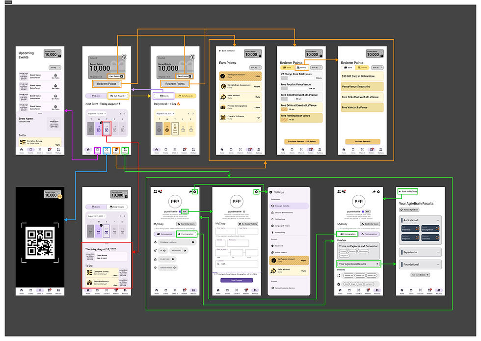
SCREENS:

Home dashboard: points meter with dollar value, recent check-ins (venue + date + mood emoji), Earn More Points / Your Data Dashboard / Connect with Others tiles, CluzyType, pending surveys.
Points/earning detail: the earning table rendered as a scannable list with progress toward the next reward.
Cluzy+ Trial Reward: free trial as a redeemable Store item, feature list, earnings-vs-cost framing.
Connect / community surface: like-minded peers, user-generated content with mood/like/comment.
Events/check-in history: consolidated list with recommendation hooks.
Privacy/data dashboard: what's been shared, dividend pool status, toggles.
AFTERWORD:
Cluzy exists in a space where users are already conditioned to distrust platforms asking for personal data.
The challenge was not simply making the dashboard engaging. It was making the platform’s intentions understandable through interaction patterns and layout decisions.
The strongest solutions often came from reversing familiar dark patterns:
Premium access became earned rather than aggressively sold
Privacy disclosures appeared inline instead of buried in settings
Rewards emphasized discovery rather than pressure
Loyalty mechanics clarified value instead of obscuring it
The project ultimately became less about maximizing engagement and more about making participation feel understandable, voluntary and transparent.